Shop Talk – Iconography
- 1.It’s never too late to hit Reset
- 2.Re-Roll or Rolling More?
- 3.Shop Talk – Area Control
- 4.Shop Talk Movement Patterns
- 5.Shop Talk – Randomness in Board Games
- 6.Shop Talk – Iconography
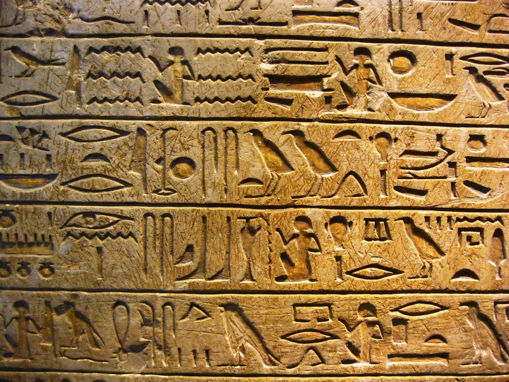
hieroglyphics
What is Iconography
In this Shop Talk we discuss iconography in board games. I was on one of my frequent business trips and I noticed that We have icons everywhere. Since my trip was to Japan, I also noticed that icons have this quality of universal expression without the need to know a particular language. This makes them perfect for conveying information in board games since it is an international hobby. We’ve been using iconography for a long time too. Hieroglyphs are essentially pictographs and icons. A combination of symbols and icons.
Now, there is a difference between an icon and a symbol. A symbol represents an idea, movement, or philosophy. Symbols don’t look like the things they represent.
As nouns the difference between symbolism and iconography
is that symbolism is representation of a concept through symbols or underlying meanings of objects or qualities while iconography is a set of specified or traditional symbolic forms associated with the subject or theme of a stylized genre of art.
From WikiDiff.com
Some examples that everyone is probably familiar with are a Cross, or Crescent, or six pointed star. These represent various religions. But they don’t look like those things. It’s hard to represent an entire philosophy in a single icon or symbol. The Red Cross is another example. But an icon is very like the thing it represents. A save icon looks like a floppy disk (for those of you too young to remember that is what we used to save computer files too. 🙂 ) A magnifying glass for search etc.

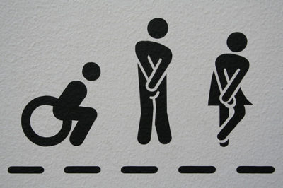
Female and Male Toilet Icons
Icons, and international language
When you travel internationally you notice certain things you will always be able to understand. The most obvious is icons for toilets. There are some pretty standard icons for male and female toilets. In Japan they go so far as to color male blue and female pink so they can even be identified from far away. Of course the Japanese with their robo-toilets also use icons…to avoid problems… yes, they even have a ‘flushing sound’ to cover up those embarrassing noises we are all worried about but I digress.
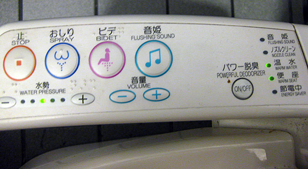
Japanese Robo-Toilet
These clear icons help you identify things even when in unfamiliar territory. Another one you will notice is traffic signage. While they aren’t all entirely universal, Speed limits for example are
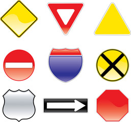
Traffic Sign Shapes
rectangular in the US and red circles with numbers in them in the EU and Australia. Most of the signs however are at least the same shape. Stop is an octagon, Yield / Give Way is an inverted triangle, caution is diamond, etc. But one of the most obvious and major uses of icons is in the Olympics.
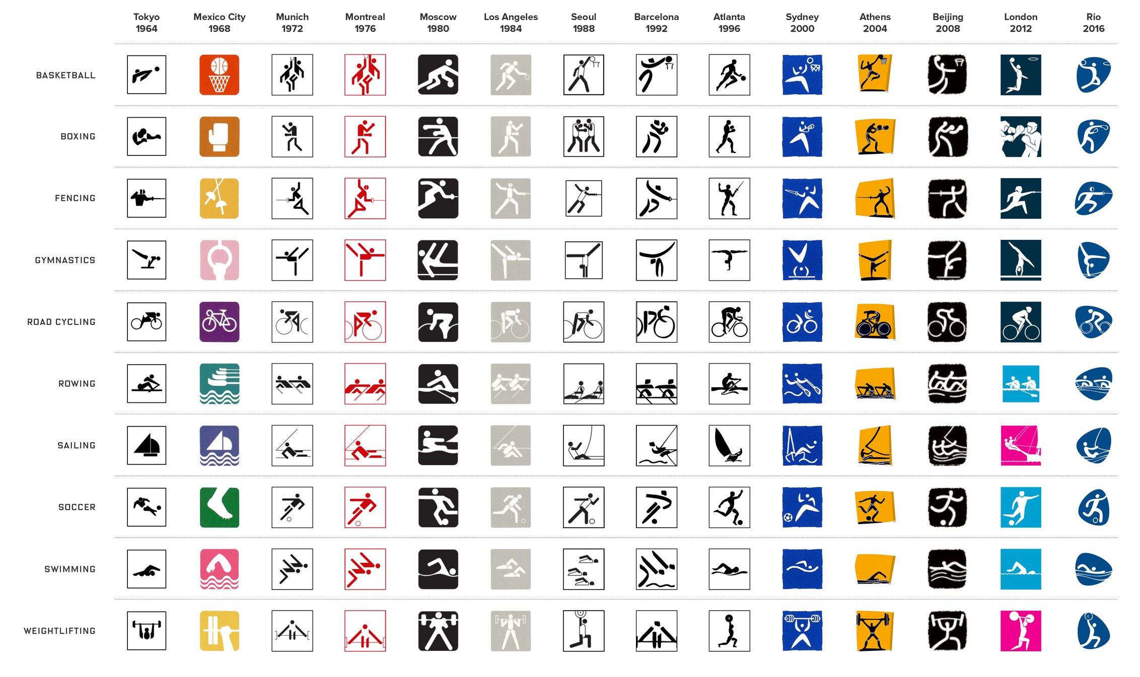
The evolution of ten Olympic event pictographs from 1964 to present INTERNATIONAL OLYMPIC COMMITTEE
All of the Olympic events are represented by Icons. This is because of the very international nature of the event. You can’t use words in a particular language. So for a very long time all of the events have been represented as Icons. Each one represents its sport cleanly, and clearly. According to the Olympic committee, the goal of an Olympic sport pictograph is to be instantly recognizable. You can see in this image that they are indeed representative of their sport and that they are quite easy to recognize.
This is something we can use in game design. Iconography can be used to help reduce the reliance on specific languages and hence translations to get messages and information to players. It can speed up a game because icons are normally recognized faster than a player having to read a word. Most icons are easier to recognize when you forget your glasses too.
Board game prevalence

Tap Icon – Wizards of the Coast
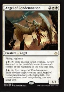
Angel of Condemnation – Copyright 2017 Wizards of the Coast.
Icons are already prevalent in games. Some good, some not so good. One of the more famous icons in games right now is the Tap symbol from Magic: The Gathering. Wizards of the Coast went so far as to patent the symbol (icon) and ‘Tap” in the context of a card game. It looks like turning something 90 degrees and in this case, that would be a card. This and the Manna symbols are used throughout the game. Manna symbols are symbols because they represent something more abstract than a sun, single drop of water, a flame, a tree, or indeed a skull. Indeed, these represent colors white, blue, red green and black respectively. They represent the idea of a particular flavor of manna generated by the lands or sources that produce that flavor of magical power.
Could they have just used colored circles to match the color of manna generated or required? Sure, but that isn’t exactly colro blind friendly. But the symbols convey that message regardless of the actual color.
In the card example to the left you can see these icons / symbols in in the text block at the bottom of the card. The first ability costs 2 generic manna, one White Manna, and the card has to be tapped to pay for the effect. But notice something. There are two words there at the top, Flying and vigilance. They didn’t use icons for those. Even though Flying has been in the game since it’s beginning, they still don’t use an icon for it. An icon would take up less space, and be easy to recognize. Sometimes they have to print the entire description of the word they just used as in this case where they explain Bolster inline on the card:
Abzan Skycaptain
3W
Creature — Bird Soldier
2/2
Flying
When Abzan Skycaptain dies, bolster 2. (Choose a creature with the least toughness among creatures you control and put two +1/+1 counters on it.)
They also do this with things like ‘Reach’. They say Reach on the card followed by the text “Creatures with Reach may block creatures with Flying”. While they have started to remove some of this extra text in more recent sets, it’s been in place for a long long time. Maybe I’ll ask Mr. Rosewater why that is.
Good iconography
Some examples of games that have been praised for having good iconography are Race for the Galaxy, Terra Mystica, 7 Wonders, Viticulture and Scythe.[/vc_column_text][/vc_column][/vc_row][vc_row][vc_column][vcex_image_grid img_size=”medium” rounded_image=”true” title=”yes” image_ids=”838,825,824,831,839,833″][/vc_column][/vc_row][vc_row][vc_column][vc_column_text]However, you have to be very careful with your icons. Icons need to be kept simple and clean. It is very easy to get icons too complex or busy and then they become hard to recognize. You have to look at them for a bit to determine what it actually is. Your icons can’t be too similar either. If a player has to do a double take on your icons, they aren’t simple or clear enough. If during play testing you notice players taking the mixing two actions up because they thought the icon meant one thing and it was regularly confused with another. Change it. This can result in players feeling confused, which leads to frustration which leads to dust on your game. Clarity is important. Remember the goal of Olympic pictographs. The goal of your icons is for them to be instantly recognizable.
A good test of this is to make sure they are recognizable even if printed in one only color. If you can print it in black and white, and recognize it at arms length, you are in pretty good shape. Remember that icons on game boards are likely to be read from two to three feet away, and sometime upside down. Test this. Maybe print them out, tape them to the wall and see how well you can read them from a little ways away. Lay them on the far side of the table and check again. Icons laid out and viewed obliquely will appear different than when viewed straight on.
Also consider how many icons you are using. If there are too many, you’ll need a player aide to map icons to meanings until the players have played enough to memorize the lexicon of your game. There is such a thing as too much of a good thing in this case. That being said, some games are built on icons and use tons of them. One of my favorites is Marvel Dice Masters.
Considerations for icons on dice
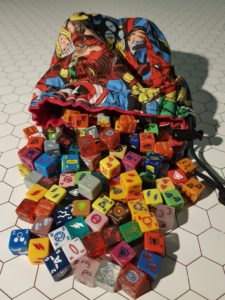
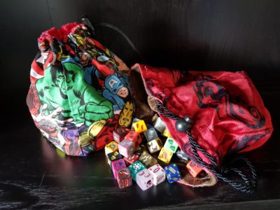
In Marvel Dice Masters (MDM), every die has several icons and symbols on them of the character they represent. This is a fantastic use of iconography. The combination of the materials of the dice (opaque, clear, speckled), dice color, marking color, and icons make each die a study in iconography and symbolism. Kudos to the group that comes up with all of the combinations for the myriad of heroes to play in the game.
The name of the hero isn’t on the dice. It wouldn’t fit. But the combination of design, materials and iconography makes each die quite recognizable, even from across the table. Dice games have a unique opportunity to really use good icons, but there are times when you need to be careful. In the game Lucidity: Six Sided Nightmares for example, the icons on the dice had to be made more similar to each other.
On my podcast I interviewed Shannon Kelly, the creator of Lucidity which is a dice drawing game. The dice you draw can be beneficial, or detrimental to you.
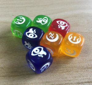
Lucidity Dice
Because of that, you have to make sure that you can’t easily identify a die from the feel of the icons or symbols on the dice. This is something that MDM has a problem with. Shannon told me that he had to make changes to his icons to make them more similar to avoid players being able to tell which die they were drawing based on the feeling of the icon on the face of the die. This is something a lot of people don’t think about and why you need to play test as much as possible with good prototypes or production proofs if you are going to do custom dice.
Common icons for board games
Icons, even for very common or universal things like roll a die, flip a card, shuffle, etc. could be made common across board games. Perhaps if there was a standard set of icons for board games, learning games would be much faster and easier. Rule books would be thinner and time from box to play would be shorter. We could certainly do it. Just because icons are standard doesn’t mean they can’t be thematic.
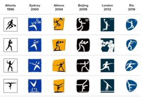
Stylized Olympic Sports Pictographs
Icons, like the Olympic sports symbols can certainly be stylized to be thematic. Consider the Olympic sports ones again. In this section you can see that the icons for the 2000 Olympics in Sydney are all very thematic. They all incorporate a boomerang into them. We could do something similar with board game icons. A standard set for the most common ones, that can be stylized for theme. What do you think about that?
You might have to come up with a rule of thumb for this, use icons that are as simple as possible while still thematically representing the mechanism fully.
So iconography is quite important in games. It keeps things visual and doesn’t intrude on the artwork like walls of text can. It makes recognition faster. We have been using them for a long time and we can take some lessons from traffic signs, the Olympics and yes even toilets. Perhaps if we had a standard set of icons, learning new games would be faster and easier. Do you have a favorite example of good iconography, or bad iconography? Let me know in the comments.
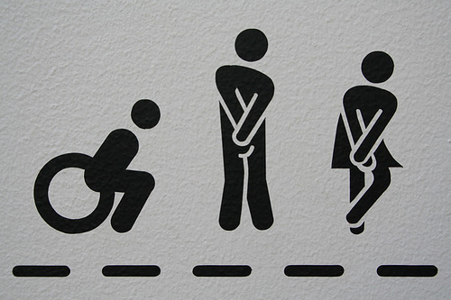
Urgent Toilet Icons

