
Game Art Progression from napkin to tabletop
One of the things that every game needs, at least to attract the eye is good game art. Good game art doesn’t just pop into existence, there is an art progression. When you are starting on a concept and you want to see if the theme and mechanics work, or if the game has legs, this can be words on scraps of paper. However, at some point you are going to progress to pictures, use some graphic design, and eventually get full art done. Especially if your game mechanics rely on the graphics of the components to identify them or provide things like places for dice, card icons, tokens, or gameboard spaces that are more than just 2 dimensional geometric shapes.
Beginning game art
When I start on a game, I first roll it around in my head for months. In some cases years. Sometimes this starts with a mechanic, sometimes with a theme. But in either case, I have a vision to what the art will be like. It may not end up that way, but it starts somewhere. Now, to make something clear, I am not an artist. I can’t draw a straight line without a ruler. So if that idea doesn’t go away, and begs to be put on the table, I tend to scrawl text and numbers on bits of paper to see if it works on the table the way it worked in my head. This isn’t art, this isn’t graphic design, it’s more of random notes.
Once I know that I won’t be giving up on the idea I will try to at least draw up some rough card designs, images on tokens. Normally though for our first play tests I’ll use a deck of poker cards and write out a table that matches the card face to an effect or in game card. This at least gives a feel for real cards. If that works with other play testers, I make rough card designs in Adobe Illustrator and print them out then stick them into card sleeves with random Magic: The Gathering land cards. This gives me a decent deck to play with and really sort out the mechanics, balance, and repeated play testing. If I need to change something mid-playtest, I slip the paper out of the sleeve and write the change on it, then we carry on.
Collecting basic art
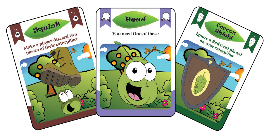
At this point, I’m pretty sure we need to look at external play testing and considering publishing this game. This is where I collect some Creative Commons Zero art from the internet and get a few of the main bits drawn up by a real artist. In the images in this post from our game Kickin’ Your Ass! the donkey artwork was done by Daniel Salcido. I knew we wanted the donkey images and I knew what I wanted them to be so I commissioned him to draw them for me. Then I used those images to put together some basic blind playtest copies of the game that we printed up at and sent out from The Game Crafter. I put his artwork on pretty simple card layouts. There was no graphic design put into them, but they started to give the flavor for the game so the play testers would be in the right mindset.
Kickin’ Your Ass! Is a fun, party style game. I didn’t want the play testers to think it was Love Letter, or Magic The Gathering. So I used bright colors and had Daniel do the fun cartoon style donkey. We like the donkey so much we named him Jack. Yes, there is innuendo implied. But this set the tone well enough to get playtesting done.
Getting to final design
I was fiddling with ideas for more graphic design, and I thought about a border or no border. This is when I started showing the cards to a game design group I participate in. One of the members of that group is a graphic designer and he (rightly) pointed out, “Before you worry about borders or not, you should do some basic graphic design first.” Yes he was very correct. Adding a border to a bad looking card does not make it a good looking card. We applied some graphic design and went through a few iterations of what the cards would be using the art from Daniel and fitting the graphic design around the fun theme and Jack.
The progression went something like this:
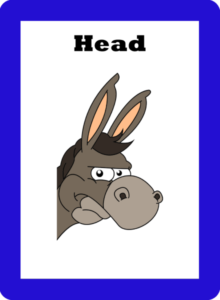
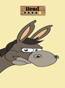
Kickin Your Ass Head Card
Very basic. Blue border added to make it a “Blue” card which signifies a Piece O’ Ass! This does not count as graphic design. But it makes it distinguishable and usable for playtesting.
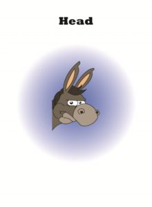
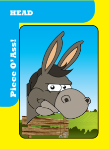
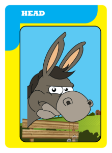
Head
Well, this one has a bit more style, but when the cards are in your hand and held like normal bridge cards or poker cards, you can’t easily tell what color the other cards you have are. This design is also, pretty simplistic (aka boring). It might pass for a 10 minute children’s game, but the game art isn’t good enough to really attract the eye, or make anyone take a second glance. So we applied some basic graphic design principles.
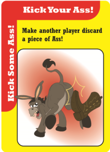
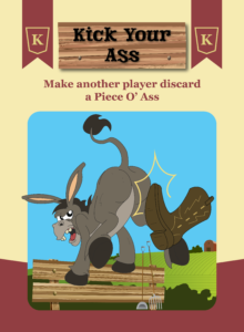
Kick Your Ass Card
This one gives a bit more for the eye to grab on to. Bold colors help convey the fun and sassy nature of the game. The color of our cards can now be easily identified even when held fanned out in the hand. The card provides all of the information required to understand it, perhaps even without reading the rules. This might be good enough, but it can be better.
Bold Colors Head Card
This one is a bit better. We kept the bright colors conveying that bold sense of fun and a bit of sass from Jack. The farm background helps add to the theme and not just be a blank background. In this case it makes the image have a home and helps set the scene. Now there are some cases when this isn’t needed. If you look at games like Fluxx and Munchkin, you don’t need to box in the art or have a background image. They have a good feel to them and that openness adds to the fun open playstyle of those games.
Almost there, but the side bar, does it need to be that repetitive? Does it really need that text? Probably not, it’s obvious from the game rules and the other similar cards that this is part of Jack. What about the title alignment? Easy to read while fanned in the hand, but not great when looked at individually. So we ended up going with the artwork and design below.
 Final Head Card |
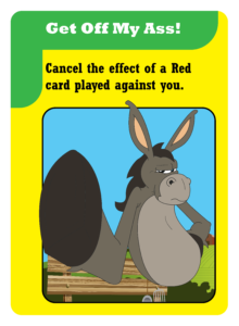 Get Off My Ass Card |
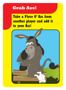 Grab Ass |
This design is clear and highlights the game art. Is it the world’s best graphic design? Probably not but it’s attractive, still uses the bold fun colors, and presents the information in a clear way while highlighting the artwork. The cards are easy to read, and when playing Kickin’ Your Ass! Drunk Edition, that can be important.
There are of course improvements that could be made. For example, this isn’t ideal for left handed players. The card colors can still be seen when fanned out by a left handed player (we actually did test that) so the type of card is identifiable but which card it is isn’t as easy to identify.
So after some input from a graphic designer, we changed some things to make it more adult, and less ‘in your face’. This is the final art we decided on:
Head Piece Of Ass
Kick Your Ass
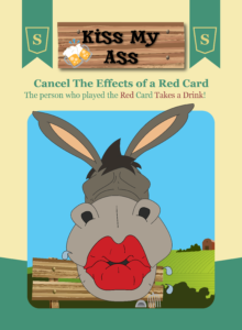
Kiss My Ass Drunk Edition
I do believe though that you could probably fiddle with and tweak every game design and bit of artwork to death. At some point you have to follow the 80/20 rule, “This will work for 80% of the audience” and ship it.
I am sure that every designer and publisher has their own style, progression and process in place. If you want to pitch a game to a publisher, you probably don’t need finished art. Clipart would be sufficient to get your ideas across. Besides, it’s the publishers job to source an artist, graphic designer, and make the game pretty. Most publishers know that games they are pitched aren’t supposed to be print ready and they are forgiving of artwork. So if you plan to pitch to a publisher, work on your mechanics, theme, and most importantly make sure the game is fun.
What has your experience been like? Do you have some hints or tips? We’d love to hear them.